Introduction:
Typography, the art and technique of arranging type, is a crucial aspect of design that has the power to elevate and transform written communication. From books and magazines to websites and advertisements, typography plays a significant role in conveying information, evoking emotions, and creating a visually pleasing experience. In this blog post, we’ll explore the fascinating world of typography, its fundamental principles, and its impact on design.
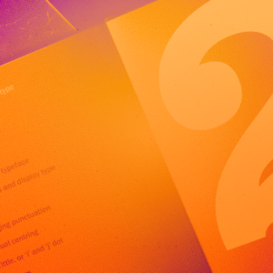
The Anatomy of Type:
To understand typography, it’s essential to grasp the basic anatomy of typefaces. Each letterform consists of various components, including the stem, ascender, descender, serif, counter, and baseline. These elements contribute to the overall personality and legibility of a typeface. Understanding how these elements interact enables designers to choose and pair typefaces effectively.
Choosing the Right Typeface:
The choice of typeface can greatly influence the tone and message of a design. There are thousands of typefaces available, each with its unique characteristics. Serif typefaces, such as Times New Roman, convey a sense of tradition, while sans-serif typefaces like Helvetica evoke a modern and clean aesthetic. Script and display typefaces, on the other hand, can add elegance or playfulness to a design. By carefully selecting typefaces, designers can align the visual language with the intended message.
Hierarchy and Readability:
Typography serves not only to deliver content but also to guide readers through information. Establishing a clear hierarchy ensures that readers can easily navigate and comprehend the text. Using various font sizes, weights, and styles, designers can emphasize important elements, such as headings or subheadings, and create a visual flow that directs the reader’s attention. Additionally, paying attention to line length, spacing, and legibility helps ensure that the text is easily readable across different mediums.
Kerning, Tracking, and Leading:
Typography is not just about selecting typefaces; it also involves precise adjustments to spacing. Kerning refers to the adjustment of space between individual letter pairs, while tracking involves the uniform spacing across a group of letters or words. Leading, on the other hand, refers to the vertical spacing between lines of text. By meticulously fine-tuning these aspects, designers can achieve balanced and harmonious typography, enhancing the overall visual appeal.
Pairing Typefaces:
Pairing typefaces is both an art and a science. Combining complementary typefaces can create visual interest and establish a hierarchy within the design. Contrast in weight, style, and structure can enhance the readability and add depth to the overall composition. However, it’s crucial to strike a balance and avoid overwhelming the reader with too many competing typefaces. The key is to select typefaces that complement each other while maintaining a coherent visual identity.
Responsive Typography:
In the digital age, where content is consumed across various devices and screen sizes, responsive typography has become vital. Designers must ensure that typography adapts seamlessly to different environments, maintaining legibility and aesthetic appeal. Responsive typography techniques, such as fluid type scaling and breakpoints, enable text to adjust dynamically, optimizing the reading experience across a range of devices.
Conclusion:
Typography is a powerful tool that shapes the way we perceive and engage with written information. By understanding the principles of typography, selecting appropriate typefaces, establishing hierarchy, and paying attention to spacing and responsiveness, designers can create visually stunning and effective designs that captivate audiences. So, let’s embrace the art of typography and continue to explore its limitless possibilities in the ever-evolving world of design.